Here you can get a quick overview of the overall situation.
•In the left area you can see the key figures.
•The donut charts show PCN and tasks numbers according to their status, type and organization.
•If you classified your parts by organization (Org) you can see the distribution in the bar charts.
•The TOP 5 charts show some rankings.
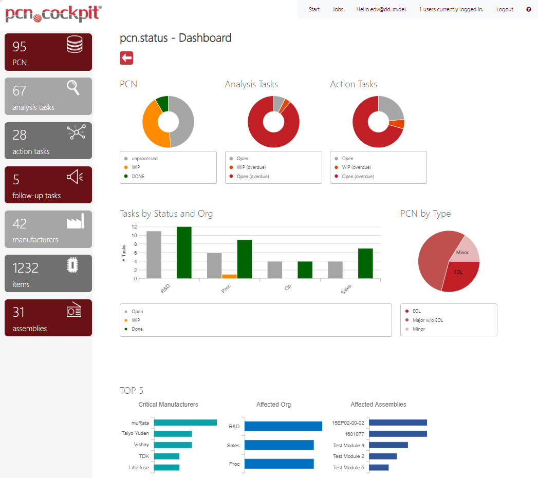
Key Figures
PCN |
Number of all PCN in pcn.store |
analysis tasks |
Number of all Analysis Tasks |
action tasks |
Number of all Action Tasks |
follow-up tasks |
Number of all Follow Ups |
manufacturers |
Number of different manufacturers in your PCN |
items |
Number of all Internal Parts in your BOM |
assemblies |
Number of all Assemblies in your BOM |
Charts
PCN |
Here you see the distribution of your PCN by processing state. |
Analysis Tasks |
Here you see the distribution of your Analysis Tasks by processing state. |
Action Tasks |
Here you see the distribution of your Action Tasks by processing state. |
Tasks by Status and Org |
Here you see the distribution of your Analysis Tasks by organizations (Org) and state. |
PCN by Type |
Here you see the distribution of your PCN by type. |
TOP 5 |
Here you see bar charts with the leading 5. |
Critical Manufacturers |
Here you find the 5 manufacturers having the highest number of EOL PCNs. |
Affected Org |
Here you find the 5 organizations (Org) having the highest number of Action Tasks. |
Affected Assemblies |
Here you find the 5 assemblies having the highest number of Tasks (Action und Analysis). |